This week I found a good recipe for writing:
I clear my desk except for my laptop, my sketchbook, and a few drawing utensils. I set to work writing, and I switch to doodling Over the Surface characters/settings/props whenever I get stuck. Pretty soon, whatever problem was stopping me in the script just unravels itself (it’s like I have to gently coax the solution out by not directly thinking about it). I set my sketchbook aside and start typing again.
On Wednesday,
Erika Moen told me about a place near Periscope where she has had good luck writing. It’s very empty and easy to focus. There’s a loud mechanical hum that is actually really great and removes the need for music, which can be distracting. She also reminded me that it's helpful to set small goals, like writing for 1 hour at a time and taking breaks to refresh yourself.
All of my studiomates have been really helpful in this writing phase. They ask how it’s going and have lots of good tips for a stage of making comics I’m not so familiar with.
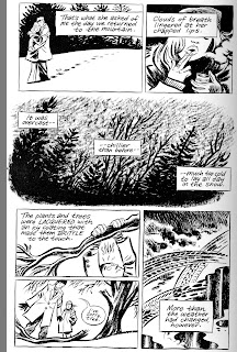
Paul Guinan has helped a lot with historical specifics. He's a buff from his research for
Boilerplate and
Frank Reade. He lent me this gem from his and Anina Bennett's collection:

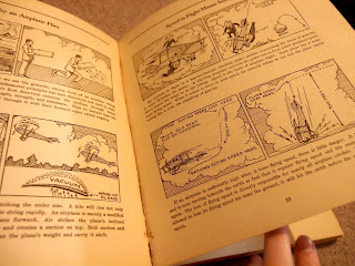
It's copyrighted 1931! It is gorgeous and has been invaluably helpful to me.
The other big thing I did this week was pinpoint art/writing styles I want to emulate in this project and what specifically it is about them that I like (some spoilers for other books):
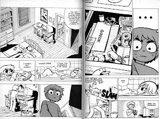
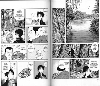
Yotsuba by Kiyohiko Azuma
I like the environments a lot in these books; Azuma (or his assistants) can pull out realism when required, but know when to simplify as well. Backgrounds never detract from the action.


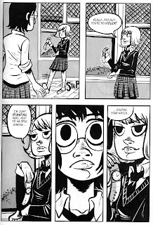
The War at Ellsmere by Faith Erin Hicks
The pacing and page turns in this book are really excellent. I like a lot of the panels for the way the line art does most of the work and tones are pretty minimal.

Scott Pilgrim by Bryan Lee O'Malley
Striking just the right mood in every single goddamn panel. Again, backgrounds omitted when they would only clutter a panel.
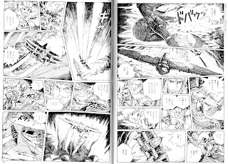
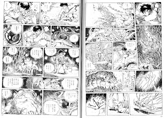
Nausicaa by Hayao Miyazaki
Line art descriptive enough to make tones unnecessary except for simple clarifying shapes or drawing attention to something. Great aerial action sequences.

I Kill Giants by Joe Kelly and J.M. Ken Niimura
Combining inking tools effectively, strong black shapes, not afraid to leave white space when appropriate, good acting.
Demo by Brian Wood and Becky Cloonan
Nice moody panels. I like a lot of the establishing shots and quiet panels drawn with solid black shapes.

Death Note by Tsugumi Ohba and Takeshi Obata
A talky comic that manages to be engaging through character acting and interspersed aspect-to-aspect transitions with conversations continuing in voice-over.
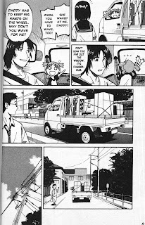
Cross Game by Mitsuru Adachi
This comic is very clear. Some panels seems inconsequential or like strange choices, but there is often a specific reason for their inclusion. Sometimes it's just to slow the pace of a page or transition smoothly to a later time. Adachi is not afraid of quiet beats or pauses in conversation. I like the expressive/simplified characters and realistic environments; this can be done poorly but it meshes well in Cross Game.
Courtney Crumrin by Ted Naifeh
Cool depictions of environments in various lighting; lots of good tricks for drawing attention to characters and placing them in the proper plane. All with black and white line art alone!
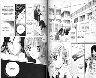
Confidential Confessions by Reiko Momochi
Interspersion of illustrative panels- - close-ups of the computer or a razor blade, etc. -- to break up conversation and be clear. Plenty of breathing room, creative page layouts. Some panels are completely filled with dialogue or toning effects, but they help the storytelling, like the gravity conveyed by a pitch black panel with the word 'cyanide'.

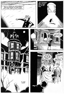
Blankets by Craig Thompson
Gorgeous establishing shots, good use of brush textures, no need for tones. I also like the way he draws things like the truck and power line poles without a ruler. They're allowed to stretch and convey motion.


Angelic Layer by CLAMP
Fantastic action sequences, use of speed lines (sometimes used in shadow areas or what would otherwise be a spot black). Sound effects as part of the panel, directing the eye and taking on descriptive shapes/textures for what they are mimicking. In the last example, I like how some black shapes have no defining interior lines in white; they're just a bold black shape, but it works.


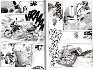
Oh! My Goddess! by Kōsuke Fujishima
Great action sequences and depictions of machines like motor bikes.